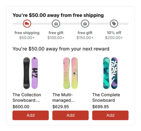
 See it in action
Gift design
On this page
The Gift design page sets how the free gift box in the cart and the Choose your free gift window look on your store. You don’t need to write code. Anything you leave empty follows your theme, so a store that never opens this page sees no change.
It works on every AndOr plan. The same design is used by Quick view.
Open Gift design
- In AndOr, open Promotions, then Storefront widgets.
- Click Gift design.
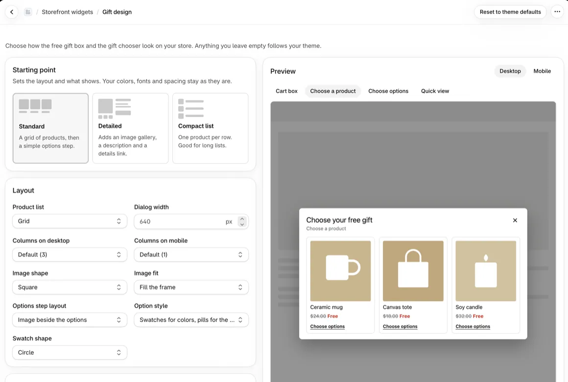
- Make your changes and watch the preview.
- Click Save. Your store shows the new design.
To go back to your theme’s look, click Reset to theme defaults.
Starting point
Pick one to set the layout and what shows. Your colors, fonts and spacing stay as they are.
| Starting point | What it looks like |
|---|---|
| Standard | A grid of products, then a simple options step. |
| Detailed | Adds an image gallery, a description and a details link. |
| Compact list | One product per row. Good for long lists. |
Layout
- Product list: Grid or List.
- Columns on desktop (1 to 4) and Columns on mobile (1 or 2). A list always has one column.
- Dialog width: 420 to 1100 px.
- Image shape: square, portrait or landscape. Image fit: fill the frame or show the whole image.
- Options step layout: image beside the options, or above them.
- Option style: swatches for colors and pills for the rest, or pills only. Swatch shape: circle or square.
What shows
- Product cards: image, price and the action label.
- Options step: image, image gallery, description, the chosen value next to the option name, and a View full details link.
The gallery, description and details link are off until you turn them on, or pick the Detailed starting point.
Colors, fonts, corners and spacing
- Colors: pick a Color theme (Theme default, Light, Dark, Soft or Bold), or set each color: background, text, accent, sale price, buttons, the selected option and the page overlay.
- Fonts: your theme font, or sans serif, serif, monospace or rounded. Set the title and text size and weight.
- Corners and spacing: dialog, card, image, button and pill corners, swatch size, padding, the space between items and the dialog shadow.
- Cart gift box: its corners and button color. The button follows the dialog’s button unless you set it here.
Custom CSS
For anything the settings can’t do, add your own CSS, up to 3,000
bytes. Start your rules with the chooser’s or the cart box’s class
name, which the page shows you. @import isn’t allowed, because it
would slow down your store.
Images must come from your store or cdn.shopify.com.
Preview
The preview shows sample products. Switch between Cart box, Choose a product, Choose options and Quick view, and between Desktop and Mobile. Your theme’s own fonts and colors show on your store.
Good to know
- One design per store. It’s used by every gift promotion.
- To change the words shoppers read, use Storefront text.
- How the chooser works for shoppers: Gift chooser.